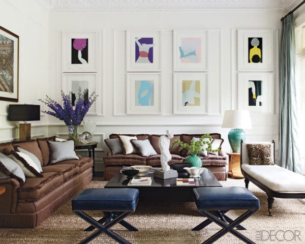
Library paneling divides walls into smaller sections and those areas are not always going to be the right relationship to the art you want to display. Shown here, white mats and frames were used and blend into the wall so they seem like a part of the architecture versus an addition that doesn’t fit with the paneling.

